Step 4: Sessions, Advanced Charts, and Tables
It is time to improve your knowledge of how to visualize the results of a simulation. This section of the intermediate tutorial is designed to consolidate concepts around plot and table commands, along with using sessions and the IronPython scripting environment to better handle data reporting and visualization. Let’s start right away!
1. Sessions to explore different scenarios
A session in SAInt is a snapshot of a scenario, along with the simulation’s solutions, opened charts, tables, and maps. By using sessions, the user can easily switch between different scenarios of the active project and extract and compare results. You can save a new session or open an existing one from  .
.
You need to create at least two different sessions to showcase their use. Let’s start by saving the project and closing all opened scenarios, tables, and charts. You should only have gNetwork1 active and displayed in a map view window.
From here, you want to load scenario BAU_DYNAMIC, open the profile table and the event table, and create a simple chart with the plot command, as follows:
plot('GDEM.INDUSTRY2.Q;title=Demand at Industrial user;legend=Outflow').
Save this status of your project as session BAU_SESSION.
Now, close again all tables, the chart, and the scenario. With only the network active, load the scenario S1_DYNAMIC. Open the event table. Create a new chart and a user-defined table by typing in the Command Window these two commands:
nplot('GCS.CS1.PI;left','GCS.CS1.PO;left','GCS.CS1.Q;right','GCS.CS1.CTRL;right')
table('GCS.CS1.PI;title=User-defined table','GCS.CS1.PO','GCS.CS1.Q','GCS.CS1.CTRL','02/02/2020 21:00','03/02/2020 07:00')
Save a new session to catch the status of your project and call it S1_SESSION. Now close SAInt GUI.
Relaunch SAInt GUI and select the option to Open Session. Navigate in the directory of the project of this intermediate tutorial and open the session S1_SESSION. You can now continue your work from where you left off with all the saved tables and charts.
If you open the session BAU_SESSION, SAInt loads all items saved in that session. The items in common with the previous session are updated (i.e., the event table will reflect the events of the business-as-usual scenario), and the others will be kept from the prior session or added to the new session. In your case, you now have both charts and tables from the two sessions.
Now you see how you could use sessions to compare different strategies to model a scenario. Session one covers a set of events. Session two covers a different set of events. You may start by loading session one, and after session two, so to be able to compare tables and charts from the two sets of events.
Please, note that when you want to update an existing session with new content, you must overwrite the old instance using the options menu:[Save Session].
|
Sessions can exist only within a project. They are saved in the project directory. |
2. Improve your charts
You have seen many examples of simple and more advanced charts in beginner tutorials. But you did not spend much time describing the charting options or the plot command’s general structure. You try to make up for that here. But remember, you can find more examples and an extended description in the section on plot functions of the reference manual of SAInt.
2.1. Personalize your plots
You can extensively personalize each property by changing its color, plot type, graphical details, axis location, and range.
Load the session BAU_SESSION and type the following text in the command line to obtain Figure 1.
plot('GCS.CS1.Q.[ksm3/h];line;dash;blue;2;left;[280;180;10];title=Title of the Chart;legend=Name of the Property')
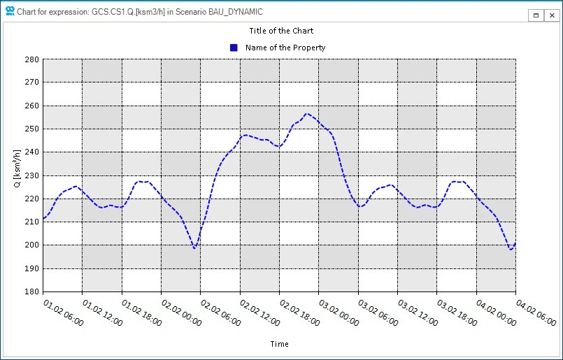
You have:
-
selected a line-type chart with a dashed pattern of color blue and thickness of 2;
-
specified that the axis where the property is displayed has to go on the left;
-
indicated the valid range for the y-axis, which starts at 180 ksm3/h, ends at 280 ksm3/h, and has 10 intervals;
-
defined the title of the chart and the name to use in the legend for property
Q.
Note that the graphical attributes of a property are separated by a ";", and their order is irrelevant. So you can write dash;blue;2; or 2;dash;blue;, and for SAInt it is the same.
2.2. The pathplot command
An advanced chart in SAInt if the "pathplot". This type of plot represents a set of properties along a path connecting a series of nodes. It is helpful when you want to check how a property change from node A to node B.
Load the session BAU_SESSION and type the following text in the Command Window to obtain Figure 2.
pathplot('GNO.N3','GNO.N2','GNO.N7','T;[C];deepskyblue;solid;4;[25,0,5];left;title=Pathplot;legend=Temperature','Q;[ksm3/h];navy;column;10;[0,-100,10];right;legend=Nodal Balance','04/02/2020 06:00')
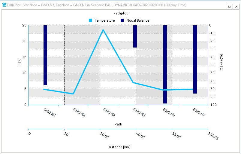
Pathplot of the temperature and the nodal outflow from node N3 to node N7.You can see that:
-
the command has a simple structure: starting node, intermediate nodes, ending node, properties to chart with their own attributes, time step of the simulation to be displayed;
-
the x-axis reports both the sequence of nodes visited along the path and the distance from the starting node;
-
you need to specify the title of the chart only once for one of the properties you want to plot;
-
you can personalize the legend entry for each property you want to plot;
-
you can mix plot types, like line charts and bar charts, as in the example.
Can you explain why the temperature is evolving like that? Remember to consider the impact of TAMB and the role of the compressor station!
|
The |
|
SAInt also provides a path version of the table command. It is called |
2.3. The subplot command
You will need to have two or more plots together in many situations. You can generate every plot and take advantage of the high flexibility offered by the SAInt GUI in combining windows. Otherwise, you can compose your charts in a unique plot container called subplot.
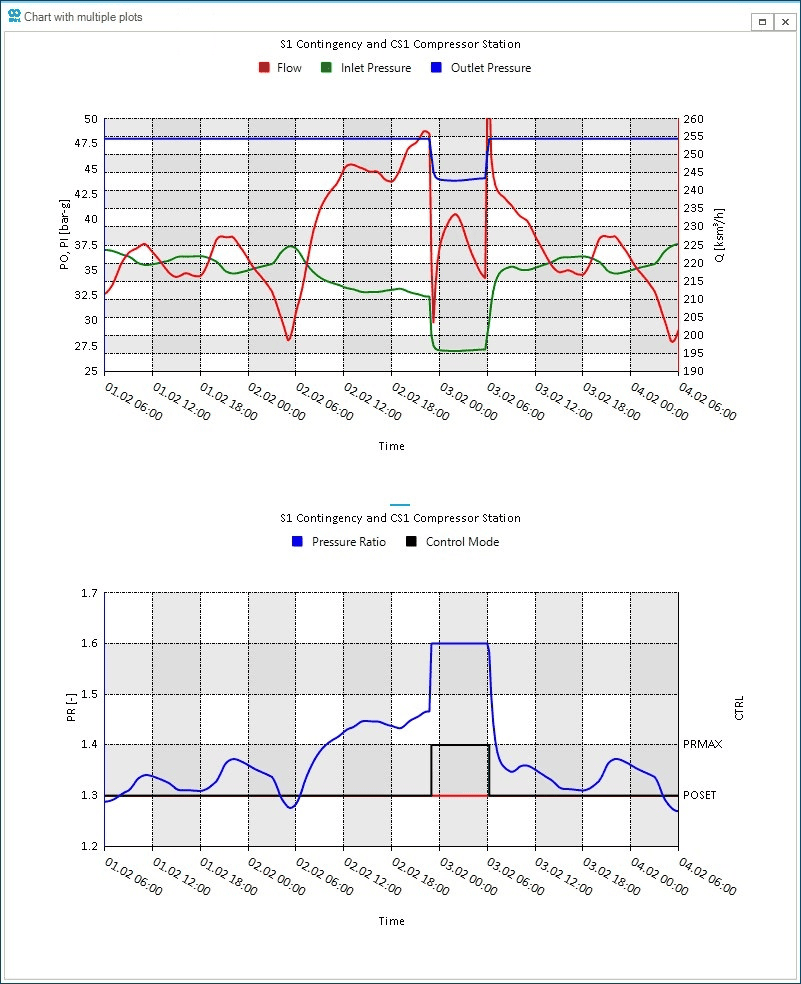
Load the session S1_SESSION and type the following text in the Command Window.
subplot(nplot('GCS.CS1.PO;[50,25,10];left;axis=1;blue;title=S1 Contingency and CS1 Compressor Station;legend=Outlet Pressure','GCS.CS1.PI;axis=1;green;legend=Inlet Pressure','GCS.CS1.Q;[260,190,14];right;red;legend=Flow'), nplot('GCS.CS1.PR;[1.7,1.2,5];left;axis=1;blue;title=S1 Contingency and CS1 Compressor Station;legend=Pressure Ratio','GCS.CS1.CTRL;right;black;stepline;legend=Control Mode'))
The resulting plot is showed in Figure 3 and describes the status of the compressor station. The subplot command stacks together the plots passed as arguments. It can accept any valid SAInt plot.
subplot.Now, add the events presented in Table 1 and run the modified scenario.
| Start Time | Object Name | Parameter | Profile | Condition | Evaluation | Value | Unit of Measure |
|---|---|---|---|---|---|---|---|
01/02/2020 08:00 |
CS1 |
|
GSUP.S1.P<40 |
DoIFTRUE |
43.0 |
bar-g |
|
01/02/2020 08:00 |
CS1 |
|
(GSUP.S1.P>=40) and (GCS.CS1.PI>32) |
DoIFTRUE |
48.0 |
bar-g |
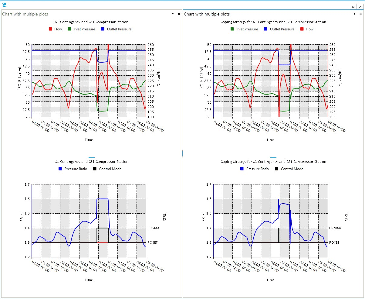
Use the same subplot command again to create a new chart describing the impact of the new strategy in using the compressor station. Just change the title of the latest chart, like title=Coping Strategy for S1 Contingency and CS1 Compressor Station.
The final step is to drag the newly generated chart on the first one and combine them, as shown in Figure 4. You can now easily graphically compare how the implemented strategy at the compressor station helps better manage the equipment by reducing the time when the maximum compression ratio is reached.
subplot command.3. Improve your tables
As for charts, the beginner tutorials introduced examples of simple and more advanced tables. But you did not explain the general structure of a table command. For more in-depth explanations and other examples, please refer to the table functions of the reference manual of SAInt.
Let’s start by personalizing a simple table. You can create a table with the pressure ratio, the inlet pressure, and the outlet pressure of the compressor station between 02/02/2020 23:00 (11 p.m.) and 03/02/2020 08:00 (8 a.m.). Check the following command:
table('GCS.CS1.PR;title=Personalized Title of a Table;header=Personalized Column "PR"', 'GCS.CS1.PI;header=Inlet Pressure','GCS.CS1.PO;header=Outlet Pressure', '02/02/2020 23:00', '03/02/2020 08:00')
You need to specify only one time the title of the table, and it could be at any of the expressions passed to the function. The header name of an expression can be specified by the term header=. Note, from the example, that you can use the special character " in the header too. Once you have finished defining all your expression terms, it is possible to set the time window to retrieve data by setting the start and end time.
Using tables, further, explore the impacts of the contingency simulated for the supply point S1. You have noticed that the simulation log reports issues at node N3 because the minimum delivery pressure is unsatisfactory.
Try this new table command:
table('GDEM.INDUSTRY2.QNS;header=Unserved Gas','GDEM.INDUSTRY2.QNS > 0;header=Is unserved?', '02/02/2020 20:00', '03/02/2020 08:00')
The table shows that after 15 minutes from the pressure drop at S1, the node N3 is affected by low pressure. From the table command, you also see that you can use logical or mathematical operations along with expressions. In the example, you asked to check which time steps have positive amounts of unserved gas in that specific time window. For example, you could create a table with the inlet and outlet pressure and a third column where you calculate the difference between the two for each time step.
Finally, note that your last table has a summary top and bottom rows reporting statistics (which you can personalize from the context menu), like the count or the sum. The sum for the column of the unserved gas does not represent the total unserved gas for the customer because you see the instantaneous values for the time step, while you need to integrate the values over the time window.
Try the command:
inttable('GDEM.INDUSTRY2.QNS;header=Unserved Gas','1[h]','02/02/2020 20:00', '03/02/2020 08:00')
Now, the sum for the "Unserved Gas" column gives the correct value of the total unserved amount because you have asked SAInt to integrate over an hour time window the function representing the instantaneous unserved gas. The user at the off-take named INDUSTRY2 experienced a curtailment of around 479.1 ksm3 over the considered time window. You could double-check by rerunning the table command but changing the integration time interval from 1 hour to 12 hours (i.e., the span of the time window).
4. Use IronPython scripting for plots and tables
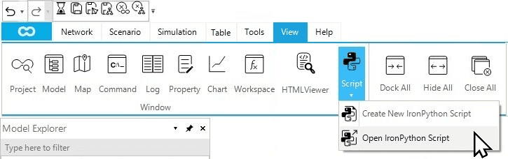
In this intermediate tutorial, you have seen many examples of long scripts, which you have copied and pasted into the Command Window. SAInt offers, along with many other great features, an IronPython interpreter. You can leverage the power of IronPython by writing and executing scripts in your SAInt session and environment. Start by opening a new script window or loading an existing script. From the View tab select (Figure 5) and load the script "command_examples.ipy" from .\Gas Networks\Intermediate Tutorial 1 of the folder Tutorials. You can also see the scripts and load them from the project explorer. Download the tutorials data from the "Model Ready Datasets" category of the community Forum.
This tutorial will not introduce IronPython as a language here. Still, it will demonstrate how to use scripts to save your work on charts and tables or to replicate such charts and tables in existing or new scenarios.
After opening the script, you can notice that all the lines are commented. A comment is indicated by a line starting with the symbol #. If you run the script now, nothing will happen as the interpreter sees just comments, which are ignored. To execute one or more commands, uncomment and run the script. Alternatively, you can copy and paste the command into the Command Window. When uncommenting, take good care in avoiding any indentation. IronPython has strict rules on spaces and text indentation. Have fun!