Run the QuasiDynamicACPF Simulation
In previous tutorial sections, we created all the elements needed to build a quasi-dynamic power flow model in SAInt. This step will focus on running the QuasiDynamicACPF simulation.
1. Execute the scenario
We have done all of the hard work and are ready to run the QuasiDynamicACPF simulation. Go to the simulation tab and press Electric. During the scenario execution, the progress can be observed in the status bar at the bottom of the screen. Additionally, the log window will display the simulation progress during each consecutive step. Once the simulation has finished, a prompt will appear saying the simulation has been completed successfully. Close the window by pressing OK.
|
If the scenario execution fails for any reason, please review the previous steps and ensure everything was correctly defined. If the problem persists, please do not hesitate to contact our support team for guidance. |
2. Animate the power system
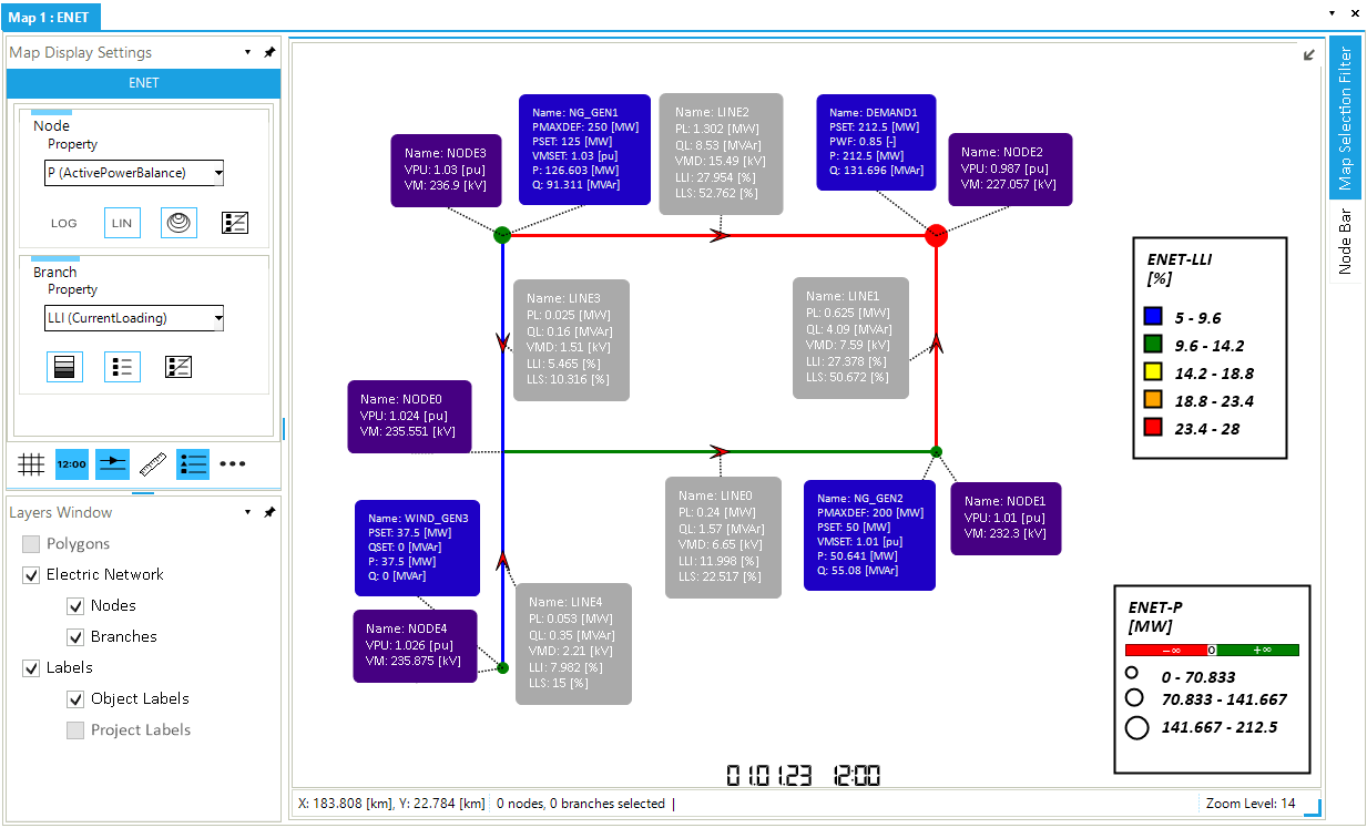
As we have covered the description of simulation logs in Step 6: Run the SteadyACPF simulation, we will now look at the animation feature of SAInt. The animation feature is a visual way of analyzing the dynamic behavior of the power flow simulation in the map window. We can change the legends on the top of the map window to display different object properties. For the nodes, we will visualize the nodal power balance (P). Navigate the map display settings window and select P as property for nodes(Figure 1). For the lines, we will visualize the line loading in terms of percentage of current loading (LLI). Navigate the branch property legend and select LLI. Checking line loadings in terms of percentage of current loading helps to determine if the line is being overloaded, which can result in power losses.
|
The colors of the branch legend are fully customizable. Select the color legend setting, shown in Figure 1, to open the settings window and edit the colors used to display the legend of the selected branch property. |
Now, press Play in the simulation tab to see how the system changes over time. Notice that the color of each branch varies according to the apparent power flow in the line at each time step. In comparison, the node’s size reflects the nodal power balance at each node. Additionally, the data displayed in the labels are updated with each time step.
Spend some time navigating the scenario time window and visualize the power system at different time steps. Use the display time on the bottom of the map window to determine which time step is being visualized in the map window. You can use the other buttons of the animation panel to change the animation speed and skip. Feel free to change the properties of the node and branch legends to visualize other properties.