Step 7: Run the Energy Market Optimization
In previous sections, you created all the elements needed to build an energy market model in SAInt. This step will focus on running the optimization model and some key features of SAInt that will help you review the results of the market optimization.
1. Execute the scenario
You have done all of the hard work and are ready to run the production cost model. Go to the simulation tab and press Electric. During the scenario execution, the progress can be observed in the status bar at the bottom of the screen. Additionally, the log window will display the optimization progress during each consecutive run. Once the final optimization has finished, a prompt will appear saying the simulation has been completed successfully. Close the window by pressing OK.
|
If the scenario execution fails for any reason, please review the previous steps and ensure everything is correctly defined. If the problem persists, please do not hesitate to contact your support team for guidance. |
2. Summary of the results in the log window
After the scenario execution is complete, a result summary can be found in the log window. The scenario summary is divided into six sections:
Total Name Plate Capacities (NCAP)-
Provides the total nameplate capacities of the different generation types included in the power system. Based on the generation units of your power system, you observed a 50/50 split between fuel and variable renewable generators.
Total Energy Demand/Generation (NRG)-
Provides the total amount of energy extracted and injected by the different externals, with the generators' generation mix and capacity factor. Here you can observe that the generation fleet meets the system demand with a significant share of renewable generation, 49.6%. This result is not surprising since the solver will prioritize the production of the cheapest generator in the system.
Total Energy Not Supplied (ENS)-
Provides the total amount of energy not supplied or curtailed for different externals. As previously stated, the demand is fully supplied. However, you can observe that a portion of wind generation is curtailed. Remember wind generation can be curtailed with no penalty costs.
Total Hydro plant Volumes (VOL)-
Provides the total amount of water volume used by the hydro plant. In your case, this is not applicable since the power system does not include any hydro plants.
Total Cost – Break Down in Cost Types-
Provides a cost breakdown of the production cost (sum of the externals VOM, fuel cost, startup, and shutdown cost) plus the other or penalty costs in the model to calculate the total overall cost of the system. You observe that the total production cost and overall cost are equal at around 600 thousand dollars for the five days simulated since you do not have any penalty cost.
Total computing time-
Provides the execution time needed to run the scenario file in seconds. Depending on your machine’s computational power, this scenario should take around six seconds.
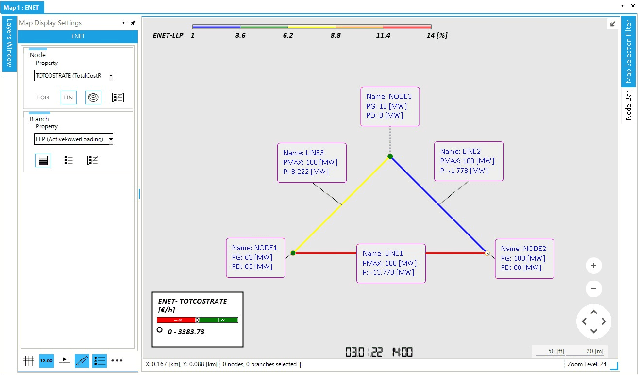
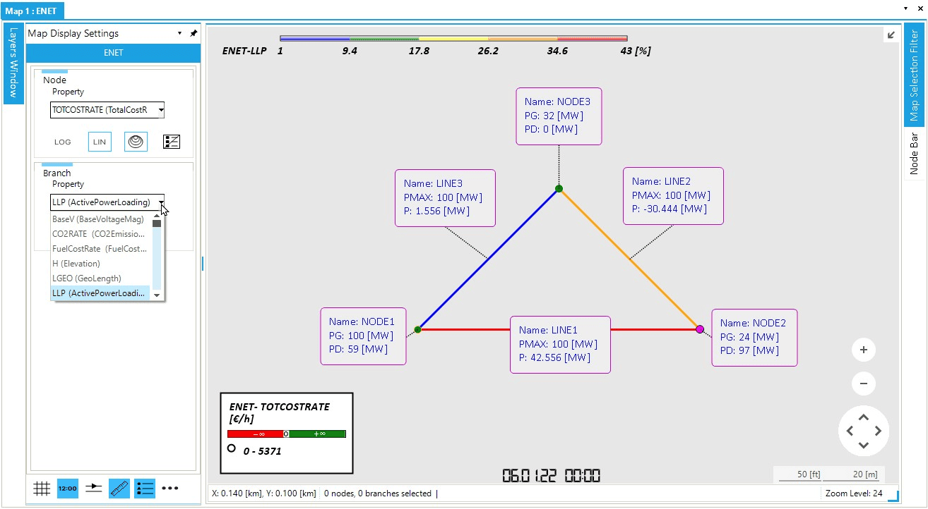
3. Animate the power system
The animation feature is a visual way of analyzing the dynamic behavior of the day-ahead market in the map window.
You can change the legends on the top of the map window to display different object properties.
For the nodes, you will visualize the cost distribution over the system using the total operational cost rate (TOTCOSTRATE), calculated as the sum of VOM and fuel cost.
Navigate the map display settings window and under "Property" for the "Node" entry select TOTCOSTRATE, As shown below in Figure 1.
For the lines, you will visualize the congestion in the system by displaying the line loading ratio (LLP).
Again from the map display settings window and under "Property" for the "Brach" entry select LLP.
Remember that the node labels display the amount of power injected (PG) and extracted (PD) from each node.
The line labels compare the active power flow (P) versus maximum capacity (PMAX).
|
The colors of the branch legend are fully customizable. Select the icon with three dots at the bottom-right corner of the "Map DIsplay Settings" window to access the class properties and change the colors. |
Now, press Play in the simulation tab to see how the system changes over time. Notice that the color of each branch varies according to the congestion in the line at each time step. In comparison, the node’s size reflects the total operational cost at each node. Additionally, the data displayed in the labels are updated with each time step.
Spend some time navigating the scenario time window and visualize the day ahead market at different time steps. Use the display time on the bottom of the map window to determine which time step is being visualized in the map window. You can use the other buttons of the animation panel to change the animation speed and skip. The figure below, Figure 2, is a snapshot of the energy market at 03.01.2022 14:00. Feel free to change the properties of the node and branch legends to visualize other properties.