Visualize data
Plots can help visualize the trends and patterns in data. The input properties and output results can be visualized using various plots, such as stack, scatter, and line plots. This tutorial focuses on generating a pre-defined plot for the wind generator WIND_GEN3 and creating custom plots for the voltage profiles and line loadings by using the plot functions in the command window of the SAInt GUI.
1. Plot time window
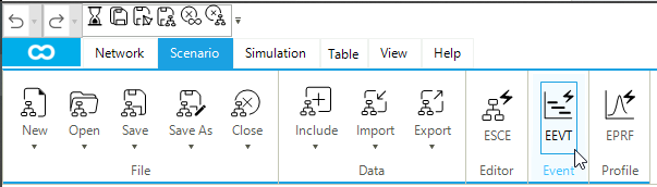
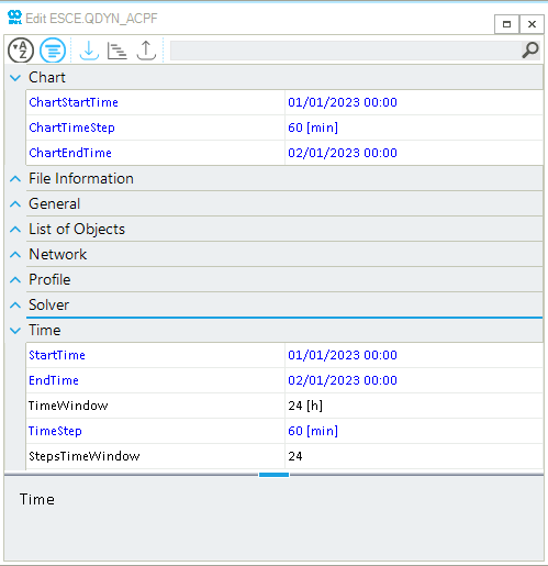
In SAInt, the plots are displayed within the pre-defined chart time window, which can be changed using the scenario editor. Before creating the plots, it is important to adjust the chart time window based on the hours or days of interest. To change the default chart time window, open the scenario editor by clicking on ESCE from the scenario tab, as shown in Figure 1.
The chart time window can be adjusted by editing the ChartStartTime (start time of a plot), ChartTimeStep (time step of the plot), and ChartEndTime (end time of a plot). Our interest is to view the complete simulation results. Therefore, let us adjust the chart time window to be the same as the scenario time window, as shown in Figure 2.
2. Access the default plot
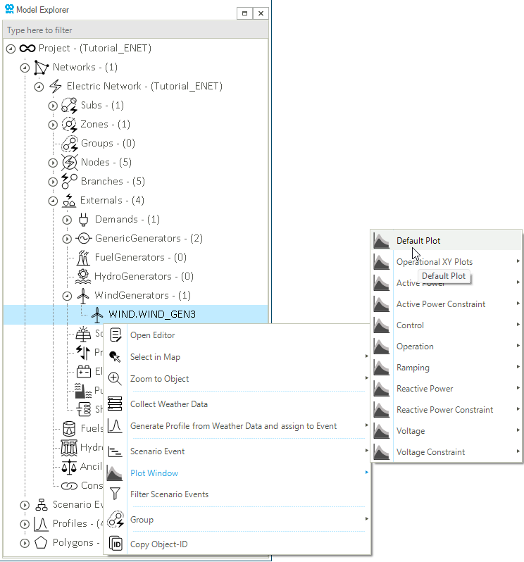
In SAInt, all the pre-defined plots for a network object are listed under the Plot Window option in the context menu. Within the pre-defined plots, the Default Plot is available to visualize basic input properties and results for a network object. Let us create the default plot for the wind generator WIND_GEN3. Right-click on from the model explorer (or node bar) to access the context menu. Select from the context menu (Figure 3). The same procedure can be used to create pre-defined plots for any object type. Feel free and spend some time visualizing other objects and results.
|
The available options in the Plot Window will differ depending on if a scenario file is loaded in SAInt GUI. |
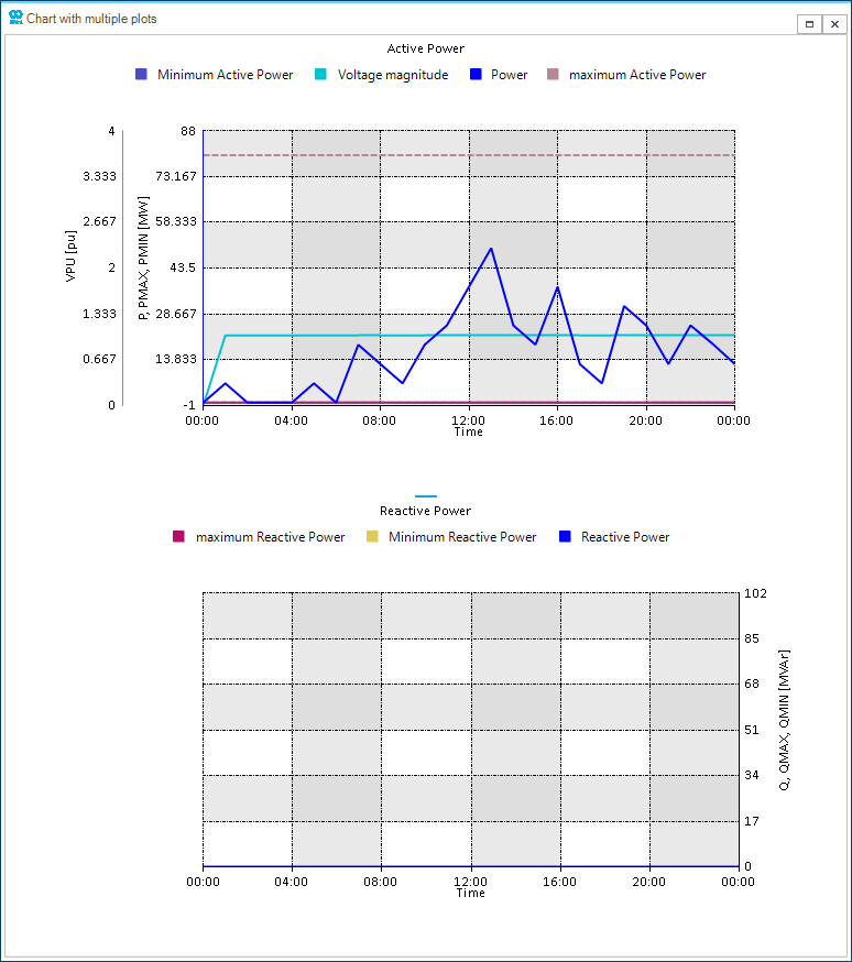
The default plot of the wind generator WIND_GEN3 is created in a separate window called a chart window (Figure 4). It has different interactive features allowing you to navigate, copy and extract the plot data. For more information on these features, please refer to the chart window section of the reference guide. The default plot for the wind generator includes the following properties:
-
Nameplate capacity or the maximum active power (
PMAX); -
Minimum active power (
PMIN); -
the voltage magnitude per unit (
VPU); -
Active power generation (
P); -
Reactive power generation (
Q); -
Maximum reactive power (
QMAX); -
Minimum reactive power (
QMIN).
Note that the reactive power is 0 throughout the simulation as it is modeled with a constant, zero reactive power output (i.e., QSET= 0). This means that the wind generator does not contribute any reactive power to the system (no voltage regulation) and only supplies real power to the network.
3. Create customized plots
In addition to the pre-defined plots, SAInt also allows the user to create customized plots using multiple plot functions. We will use the results from the QuasiDynamicACPF scenario to visualize the generation mix and voltage profiles using the stackplot and nplot functions in the command window. The command window is located under the map window by default and can be opened by clicking on the Command button from the view tab.
|
Please refer to the plot function section of the reference guide to learn more about the plotting functions' syntax, input expressions, and specifications. |
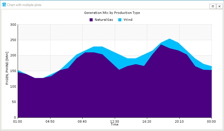
3.1. Generation by Production Type
The "Generation by Production Type" is a valuable plot for understanding the dispatch of the generation fleet in the power flow simulation. In our example, we will use the network parameters PXGEN and PWIND and stackplot function to generate this plot. The PXGEN and PWIND parameters represent the aggregated total generation per each generation type in the network. Type the expression below in the command window to create the stackplot (Figure 5). Notice that the order of the stacking areas follows the order of expressions in the stackplot command.
- Plot expression
-
stackplot('ENET.PXGEN;indigo;[300,0,6];legend=NaturalGas;title=Generation Mix by Production Type','ENET.PWIND;deepskyblue;legend=Wind','01/01/23 01:00','02/01/23 00:00')
3.2. Voltage profiles
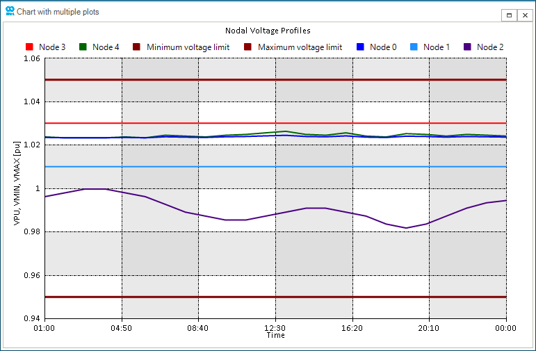
Nodal voltages can be plotted over time to observe the dynamic behavior of the voltages as the system responds to changes in generator outputs, load changes, and other dynamic events. We will create voltage profile plots using the VPU, VMAX, and VMIN properties of electric nodes and the nplot function. Type the expression below in the command window to create the voltage profile plot (Figure 6).
- Plot expression
-
nplot('ENO.NODE0.VPU;2;blue;[1.06,0.94,6];title=Nodal Voltage Profiles;legend=Node 0','ENO.NODE1.VPU;2;dodgerblue;legend=Node 1','ENO.NODE2.VPU;2;indigo;legend=Node 2','ENO.NODE3.VPU;2;red;legend=Node 3','ENO.NODE4.VPU;2;darkgreen;legend=Node 4','ENO.NODE1.VMIN;3;maroon;legend=Minimum voltage limit', 'ENO.NODE1.VMAX;3;darkred;legend=Maximum voltage limit','01/01/23 01:00','02/01/23 00:00')
The voltage profiles for all the nodes is shown in Figure 6. The vertical axis represents the actual voltage profiles with the maximum and minimum limits in [p.u.] and the horizontal axis represents time. The voltages at NODE1 and NODE3 is constant and enforced by the generators NG_GEN1 and NG_GEN2, respectively. For other nodes, the voltage profiles are comprised within the defined voltage limits which ensures the stability of the power system.