Step 1: Visualize Data
Plots help visualize trends and patterns in your data. The input properties and output results can be visualized with several plots, such as stack, scatter, and line plots. This tutorial focuses on generating a pre-defined plot for the supply point GSUP.SUPPLY1 and some custom plots for the demand off-take points by using the plot functions in the command window of SAInt GUI.
1. Plot time window
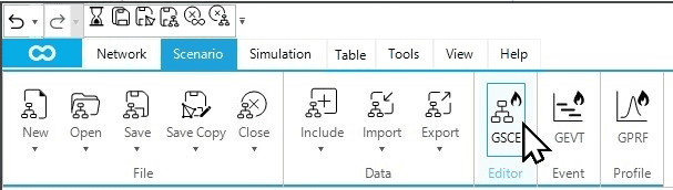
In SAInt, plots are displayed considering a pre-defined time window for charts, which can be changed using the scenario editor. Before creating the plots, adjusting the chart time window based on the hours or days of interest is recommended. To change the default chart time window, open the scenario editor by clicking on GSCE from the scenario tab, as shown in Figure 1.
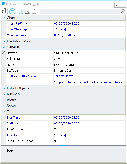
The chart time window can be adjusted by editing the ChartStartTime (i.e., the start time of a plot), ChartTimeStep (i.e., the time step of the plot), and ChartEndTime (i.e., the end time of a plot). Let’s imagine that your interest is to view what is happening only between 12:00 (12:00 p.m.) and 22:00 (10:00 p.m.). Therefore, let us adjust the chart time window to this time window, as shown in Figure 2. You leave unchanged the time step to 15 minutes.
2. Access the default plot
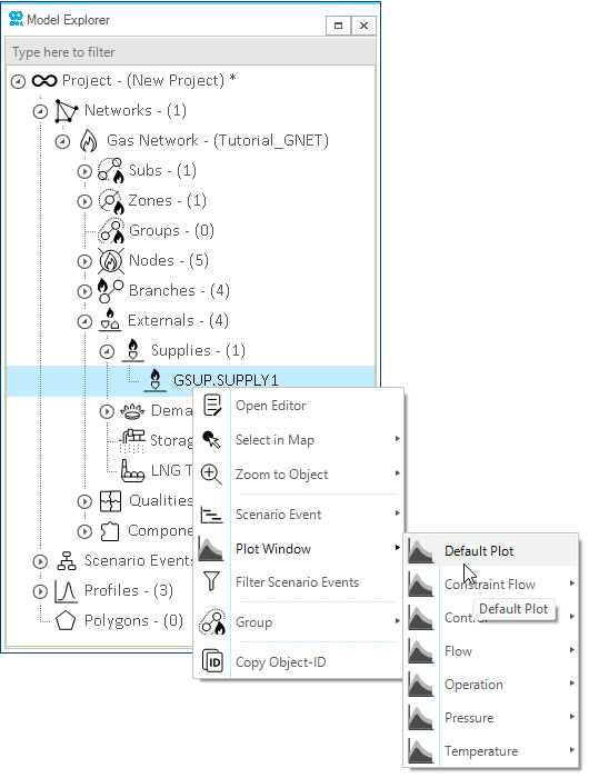
In SAInt, all the pre-defined plots for a network object are listed under the Plot Window option in the context menu for the object. Within the pre-defined plots, the Default Plot is available to visualize a network object’s basic input properties and results. Let us create the default plot for the supply point SUPPLY1. Right-click on the object GSUP.SUPPLY1 from the model explorer (or node bar) to access the context menu. Select from the context menu, as shown below in Figure 3. This exact procedure can be used to create pre-defined plots for any object type. Feel free and spend some time visualizing other objects and results.
|
The available options in the Plot Window will differ depending on if a scenario file is loaded in SAInt GUI. |
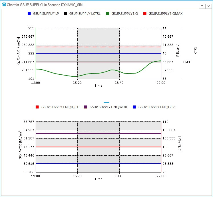
The default plot of the supply point SUPPLY1 is created in a separate window called a chart window, as shown in Figure 4. The chart includes at the top the pressure (P), the control mode of the object (CTRL), the gas flow (Q), and the maximum flow allowed for the supply (QMAX). At the bottom, the chart shows the molar percentage of the methane (NQ!X_C1), the Wobbe index (NQ!WOB), and the Gross Calorific Value (NQ!GCV) of the gas mixture. The chart window has different interactive features allowing you to navigate, copy and extract the plot data. For more information on these features, please refer to the chart window section of the reference guide.
|
Default plots can be changed and personalized using the tab "Default Chart" from the general settings of SAInt. For example, you could remove the chart in the bottom part of Figure 4. |
3. Create customized plots
In addition to the pre-defined plots, SAInt allows users to create customized plots using multiple plot functions. You will use the results from the first beginner tutorial to visualize flows using the plot, stackplot, and nplot functions in the command window. The command window is below the map window by default and can be opened by clicking on the Command button from the view tab.
|
Please refer to the plot function section of the reference guide to learn more about the plotting functions' syntax, input expressions, and specifications. |
3.1. Total demand by type of user
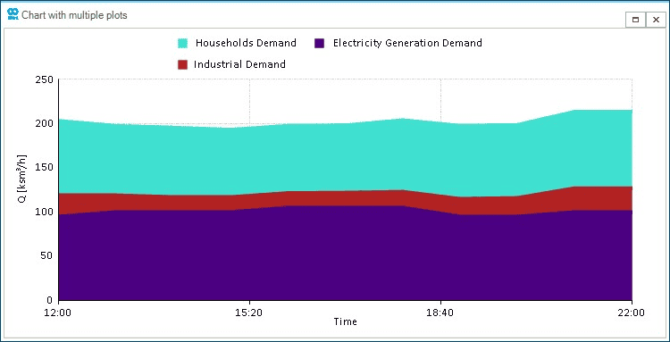
The total demand by type of user is a valuable plot for understanding how gas is used in your system. In this example, you will assume that DEMAND1 is a gas-fired power plant producing electricity, DEMAND2 is a city gate covering the needs of households, and DEMAND3 is a small industrial user. Enter the expression below in the command window to create the stackplot, as shown in Figure 5. Notice that the order of the stacking areas follows the order of expressions in the stackplot command.
- Plot expression
-
stackplot('GDEM.DEMAND1.Q;indigo;legend=Electricity Generation Demand', 'GDEM.DEMAND3.Q;firebrick;legend=Industrial Demand', 'GDEM.DEMAND2.Q;turquoise;[250,0,5];legend=Households Demand')
3.2. Supply and demand bar plot
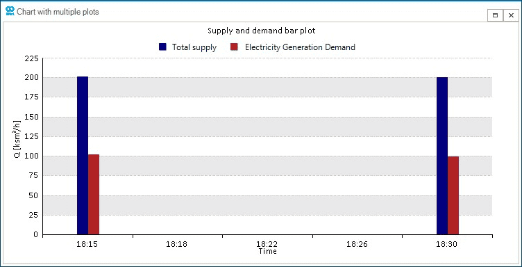
You can use bar plots to focus on certain time steps and compare different nodes. For example, compare the total system supply against the consumption of the gas-fired power plant at the off-take point DEMAND1 between 18:15 and 18:30 (06:15 p.m. and 6:30 p.m.). Enter the expression below in the command window to create the curtailment plot, as shown in Figure 6.
- Plot expression
-
nplot('GSUP.SUPPLY1.Q.[ksm3/h];[225,0,9];title=Supply and demand bar plot;legend=Total supply;column;navy', 'GDEM.DEMAND1.Q.[ksm3/h];legend=Electricity Generation Demand;column;firebrick','01/02/2020 18:15','01/02/2020 18:30')
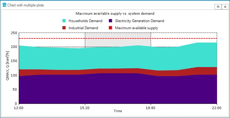
3.3. Maximum available supply vs. system demand
You will mix a stackplot and a line plot from the last example. You need to rework the stackplot for the total demand by type of user and add the maximum available supply at SUPPLY1 (QMAX). In this approach, you can have a visual description of the remaining flexibility for the supply within the time window. Enter the expression below in the command window to create the comparison plot, as shown in Figure 7.
- Plot expression
-
nplot('GDEM.DEMAND1.Q;indigo;stack;legend=Electricity Generation Demand', 'GDEM.DEMAND3.Q;stack;firebrick;title=Maximum available supply vs. system demand;legend=Industrial Demand', 'GDEM.DEMAND2.Q;stack;turquoise;legend=Households Demand','GSUP.SUPPLY1.QMAX;[250,0,5];red;dash;legend=Maximum available supply')