Step 8: Run a Quasi-Dynamic Simulation
In previous tutorial sections, you have expanded your knowledge of how to build a time-dependent thermal model in SAInt. This final step will focus on running a quasi-dynamic simulation, checking the log of the simulation, and exploring the results using the object labels, the animation, the command window, tables, and charts.
1. Execute the scenario
You are ready to run your scenario with quasi-dynamic conditions for the tutorial thermal network. Go to the simulation tab and press Thermal. As in the steady state case, the simulation progress can be observed in the status bar at the bottom of the screen. Additionally, the log window will display the simulation progress during each consecutive run. Once the simulation has finished, a prompt will appear with the message "QuasiDynamic Thermal simulation completed successfully!". Close the window by pressing OK.
|
If the scenario execution fails, please review the previous steps and ensure everything is correctly defined. If the problem persists, please do not hesitate to contact your support team for guidance. |
2. The log of the simulation
Remember always to have a look at the messages in the log window. Especially in quasi-dynamic simulations, you need to understand how SAInt handles possible constraint violations. So, review any relevant message pointing to a control change or other potential issues! You can use filters in the log window to quickly access a set of messages. For example, enter "Convergence" in the header "Contains:" to explore how filtering works. Delete the string to go back to the complete log.
Your simulation has no issue; you will not find any yellow or red lines. But you will see that the log is longer compared to the steady state simulation. This behavior happens because SAInt informs us of what it is doing during each of the 96 simulation steps!
3. Animate the gas system
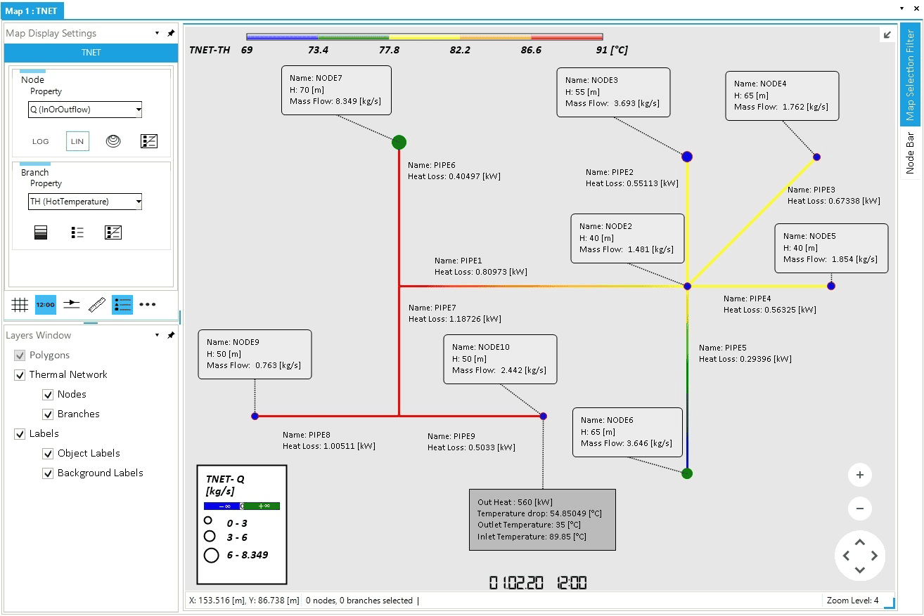
The animation feature is a visual way of analyzing the dynamic behavior of a thermal network in the map window. Make sure to select "Q (InOrOutflow)" in the node property legend and to select "TH (HotTemperature)" in the branch property legend at the left side of the map window in the Map Display Settings (Figure 1). Check that the icon for the time stamp is selected (i.e., is in dark blue) at the bottom of the map display settings window.
Now, press Play in the simulation tab to see how the system changes over time. With the branch legend defined in the previous step, you will see changes in the pipeline colors at certain hours, but notice how the values in the labels update for each time step. Press Play a second time to stop the animation. You can adjust the speed of the animation by setting an higher value for the "Shift Time" parameter.
Congratulations, you have carried out your first quasi-dynamic simulation of a thermal network in SAInt!
4. Access results using the command window
Alternatively, it is possible to access properties and results by typing in the Command Window the object type, the name of the object, and the extension you are interested in. For example, to retrieve the mass flow at NODE5 for the time step indicated by the time stamp in the map window just type TNO.NODE5.Q. It is also possible to specify the time step of interest with TNO.NODE5.Q.(5) (i.e., in brackets the time in hours). Or select a different unit of measure. For example, with HDEM.HDEMAND5.PHI the heat out is provided using the project default unit of measurement for heat flow. To display in kilowatts is enough to type HDEM.HDEMAND5.PHI.[kW] (i.e., in square brackets the new unit of measurement). Check the lexicon in the user documentation folder for details on the admissible units of measurement.
You can experiment by cross-checking the figures for HDEMAND10 displayed in the label and retrieved using the command window.
5. Show results in tabular form
The command window allows for a great deal of flexibility in retrieving data from a successful simulation. For example, it is possible to create a table combining the time series of heat demand and mass flow for a set of demand points. Type the command table('TNO.NODE5.Q','HDEMAND5.PHI.[kW]', 'TNO.NODE10.Q','HDEM.HDEMAND10.PHI.[kW]') to create a table for HDEMAND5 and HDEMAND510.
You can export the table to further process the data in a different spreadsheet software. Or you can derive some statistical insight by showing the summary top or bottom rows and select a relevant statistics for each different column.
It is also possible to perform a certain class of operations on the data, like for example summing up a value over all objects. Type in the command window esum('TPI.%.Loss.(5).[kW]') to retrieve the sum of the the heat losses on the hot side in the pipelines for the hour 5.
|
The example of the total heat loss in the hot pipelines can be retrieve also by using the equivalent attribute at the network level. Type |
6. Show results using charts
Charts are one of the best way to retrieve and present the results of a quasi-dynamic simulation. They allow to combine multiple time series and to explore the dynamics of different properties.
Select an object from the map view or the model explorer and right-click. From the context menu, select Plot Window and choose the type of chart you want to create from one of the many provided. For example, when selecting HDEMAND5 (either from the model explorer or the node bar for NODE5), we can create a chart for . The chart is presented on its own window. If you right-click on the window, the context menu offers a variety of functions to export the chart or the associated data.
Alternatively, it is possible to use the command window and typing:
plot('HDEM.HDEMAND5.PHI.[kW];title=Heat Demand Dynamic for HDEMAND5;legend=demand HDEMAND5;green;left;[660,160,10]')
where we can control the title of the chart and the legend items. We can specify the color of the line, the unit of measure, the position of the axis, and its range for the displayed values.
We can also plot multiple time series by using the command nplot, like for example:
nplot('HDEM.HDEMAND5.PHI.[kW];title=Dynamic of demand HDEMAND5;legend=Heat Flow;green;left;[660,160,10]','HDEM.HDEMAND5.TO;legend=Temperature Outlet;blue;right;[35,15,10]')