Plot Functions
This section describes the plot functions available in SAInt. These functions are used to visualize object input properties and output results to understand and compare the behavior of an object within a defined time window and simulation.
We start by introducing in Section 1 how to personalize a chart by adding a title, a legend, modifying the graphical properties, and changing the behavior of the y-axes. We then describe in Section 2 all plots function available in SAInt presenting their own syntax and showing examples with output. The syntax of the functions include expr which refers to the input expression. The examples shown are based on the dynamic scenarios of the sample electricity (ENET09_13) and gas (GNET29_18) networks available in the user’s Projects folder (C:\...\Documents\encoord\SAInt-v3\Projects). Please consider the type of object used in the expression to select the correct network. Scenario results must be available for the expression to be executed correctly in the command window. Note that the sample electricity (ENET09_13) model uses a stochastic profile for the hydro reservoir. This is why the user may get different results from the ones presented here or each time the same command is used in the active session of SAInt.
The user can easily copy and paste the code in the command window and replicate the examples.
1. Personalize a plot
SAInt allows the user to define a rich set of graphical properties for any of the built-in plot functions. It is possible to change and customize:
-
the line width (LW);
-
the line style (LS);
-
the line color (LC);
-
the title (Ti);
-
the name of items comprising the legend (Le);
-
y-axis range and subdivision ([Max,Min,Div]);
-
reference axis (Ref.Axis);
-
type of the chart (TypeC).
The general syntax of the expression for all these optional graphical aspects is:
ObjectType.ObjectName;LW;LS;LC;CL;Ti;Le;[Max,Min,Div];Ref.Axis;TypeC
SAInt requires that the optional arguments are separated by ";". When no customization property is specified, a default value is used. In the case of colors, the default is a randomized value. The exact order of the elements in the sequence is not relevant, but we advise to follow the proposed succession.
The final expression is passed to the plot function between single quotation marks (preferred) or by double quotation marks. SAInt will prompt an error if quotation marks are unbalanced.
|
The user can change the properties of the font used in charts in the general settings of SAInt in the "Fonts" tab. The change will affect any new chart. |
|
SAInt does not accept two objects having the same color. |
1.1. Line width
The user can specify the width of the line plot as an integer. If not specified, the default line width is 2.
Examples:
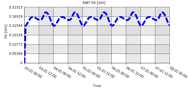
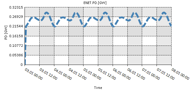
plot('ENET.PD.[GW];6')-
Plots the active power demand, in gigawatts, of the electric network as a line with a line width of 6.
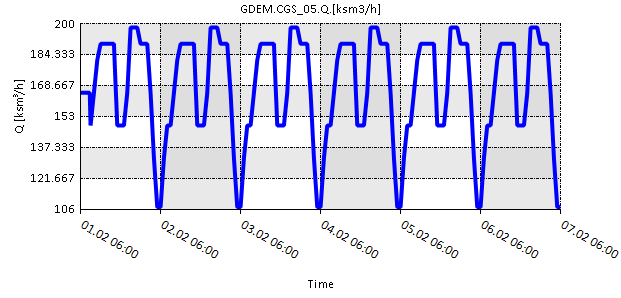
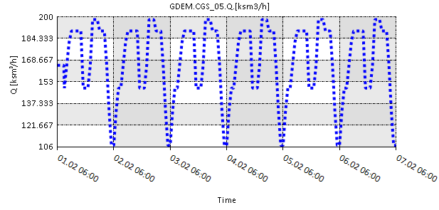
plot('GDEM.CGS_05.Q.[ksm3/h];4')-
Plots the satisfied demand, in ksm3/h, of the external CGS_05 as lines with a line width of 4.
1.2. Line style
The user can specify the style of the line plot from five available line styles in SAInt. The available styles are: dash, dashdot, dot, dashdotdot, and solid. If not specified, solid line style is used as default.
Examples:
plot('ENET.PD.[GW];6;dash')-
Plots the active power demand, in gigawatts, of the electric network as a line with a line width of 6 and a dash style.
plot('GDEM.CGS_05.Q.[ksm3/h];4;dot')-
Plots the satisfied demand, in ksm3/h, of the external CGS_05 as lines with a line width of 4 and a dotted style.
1.3. Color
The user can specify the color of the plot using a color name or an RGB value. If no color or RGB value is specified, a random color is used.
- Color names
-
The user can choose colors for the plots from the variety of available colors. List of available color names. provides the complete list of available colors. It is possible to use both upper and lower case for color names.
- RGB values
-
The user can specify RGB values in the range [0,255] to specify the plot color. The values can be entered using the following syntax:
- r255g0b0
-
r,g,b correspond to the red,green, and blue. The number next to r,g,or b represents the level of red, green, and blue colors in the specified color.
- g100b0r50
-
The order of the color specification is not constrained.
- R150G50B100
-
Both upper and lower case letters are allowed.
List of available color names.
AliceBlue |
DarkOliveGreen |
Indigo |
MediumPurple |
Purple |
AntiqueWhite |
DarkOrange |
Ivory |
MediumSeaGreen |
Red |
Aqua |
DarkOrchid |
Lavender |
MediumSlateBlue |
RosyBrown |
Aquamarine |
DarkRed |
Khaki |
MediumSpringGreen |
RoyalBlue |
Azure |
DarkSalmon |
LavenderBlush |
MediumTurquoise |
SaddleBrown |
Beige |
DarkSeaGreen |
LawnGreen |
MediumVioletRed |
Salmon |
Bisque |
DarkSlateBlue |
LemonChiffon |
MidnightBlue |
SeaGreen |
Black |
DarkSlateGray |
LightBlue |
MintCream |
SandyBrown |
BlanchedAlmond |
DarkTurquoise |
LightCoral |
MistyRose |
SeaShell |
Blue |
DarkViolet |
LightCyan |
Moccasin |
Sienna |
BlueViolet |
DeepSkyBlue |
LightGoldenrodYellow |
NavajoWhite |
Silver |
Brown |
DeepPink |
LightGray |
Navy |
SkyBlue |
BurlyWood |
DimGray |
LightGreen |
OldLace |
SlateBlue |
CadetBlue |
DodgerBlue |
LightPink |
Olive |
SlateGrey |
Chartreuse |
Firebrick |
LightSalmon |
Orange |
Snow |
Chocolate |
FloralWhite |
LightSeaGreen |
OliveDrab |
SpringGreen |
Coral |
ForestGreen |
LightSkyBlue |
OrangeRed |
SteelBlue |
Cornsilk |
Fuchsia |
LightSlateGray |
Orchid |
Tan |
CornflowerBlue |
Gainsboro |
LightSteelBlue |
PaleGoldenrod |
Teal |
Crimson |
GhostWhite |
LightYellow |
PaleGreen |
Thistle |
Cyan |
Gold |
Lime |
PaleTurquoise |
Tomato |
DarkBlue |
Goldenrod |
LimeGreen |
PaleVioletRed |
Transparent |
DarkCyan |
Gray |
Magenta |
PapayaWhip |
Turquoise |
DarkGoldenrod |
Green |
Linen |
PeachPuff |
Violet |
DarkGray |
GreenYellow |
Maroon |
Peru |
Wheat |
DarkGreen |
Honeydew |
MediumAquamarine |
Pink |
White |
DarkKhaki |
HotPink |
MediumBlue |
Plum |
WhiteSmoke |
DarkMagenta |
IndianRed |
MediumOrchid |
PowderBlue |
YellowGreen |
Examples:
plot('ENET.PD.[GW];6;dash;SteelBlue')-
Plots the active power demand, in gigawatts, of the electric network as a line with: line width of 6, dash style, and in green color.
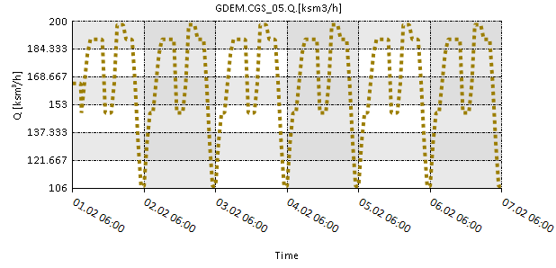
plot('GDEM.CGS_05.Q.[ksm3/h];4;dot;R255G25B0')-
Plots the satisfied demand, in ksm3/h, of the external CGS_05 as lines with: line width of 4, dotted style, and in "SteelBlue" color.
1.4. Chart title and legend
The user can use the title and legend variables in the input expression for all plotting functions to define the title of the plot and the name displayed in the legend box for the parameter, respectively.
The keywords title and legend can start we lower- or upper-case letters. The string passed to the variables cannot be displayed on two lines. Any valid UNICODE character is accepted.
SAInt will automatically order and distribute legend entries.
Examples:
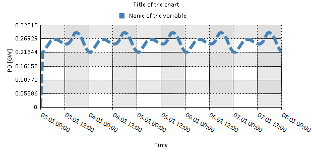
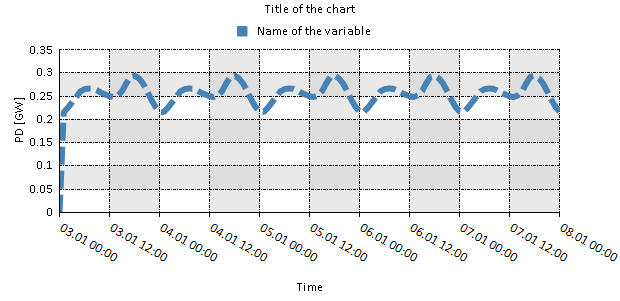
plot('ENET.PD.[GW];6;dash;SteelBlue;title=Title of the chart;legend=Name of the variable')-
Plots the active power demand, in gigawatts, of the electric network with the chart as a line with: line width of 6, dash style, and in green color. A title and a legend are added to the chart.
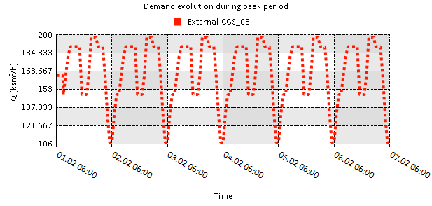
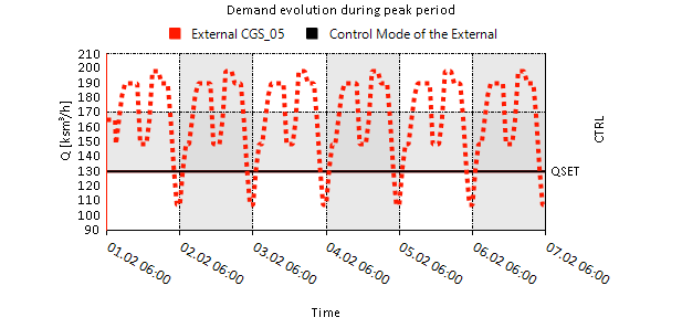
plot('GDEM.CGS_05.Q.[ksm3/h];4;dot;R255G25B0;title=Demand evolution during peak period;legend=External CGS_05')-
Plots the satisfied demand, in ksm3/h, of the external CGS_05 as lines with: line width of 4, dotted style, and in "SteelBlue" color. A title and a legend are added to the chart.
1.5. Maximum, minimum, and number of intervals for y-axis
SAInt allows to customize only the y-axis of any chart. The x-axis is automatically defined based on the simulation length or the selected path in the network.
The user can set the maximum values, the minimum value, and the number of intervals to divide the y-axis. The format of the customization of the axis is: [Max, Min, Number of Intervals].
Examples:
plot('ENET.PD.[GW];6;dash;SteelBlue;title=Title of the chart;legend=Name of the variable')-
Plots the active power demand, in gigawatts, of the electric network with the chart as a line with: line width of 6, dash style, and in green color. A title and a legend are added to the chart. The y-axis is set between the maximum value of 210 ksm3/h and the minimum value of 90 ksm3/h, and divided into 12 equal intervals.
plot('GDEM.CGS_05.Q.[ksm3/h];4;dot;R255G25B0;title=Demand evolution during peak period;legend=External CGS_05;[210;90;12]')-
Plots the satisfied demand, in ksm3/h, of the external CGS_05 as lines with: line-width of 4, dotted style, and in "SteelBlue" color. A title and a legend are added to the chart. The y-axis is set between the maximum value of 210 ksm3/h and the minimum value of 90 ksm3/h, and divided into 12 equal intervals.
1.6. Reference axis
In charts where more than one property is displayed, the user can specify on which y-axis a certain property should be plotted. The left or right y-axis can be selected by using the variable axis in the input expression of the plot functions. This option is helpful to group properties that share the same unit of measure or to programmatically separate properties to make the chart easier to understand.
Note that the option is available only when multiple properties are plotted, so it does not affect the behavior of the plot command.
Valid values for the axis variable are "left" for the left y-axis or "right" for the right y-axis. The keyword is optional.
Examples:
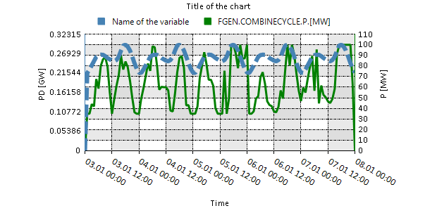
nplot('ENET.PD.[GW];6;dash;SteelBlue;title=Title of the chart;legend=Name of the variable;axis=left','FGEN.COMBINECYCLE.P.[MW];Green;3;[110,0,11];right')-
Plots, on the left y-axis, the active power demand, in gigawatts, of the electric network with the chart as a line with: line width of 6, dash style, and in green color. A title and a legend are added to the chart. The y-axis is set between the maximum value of 210 ksm3/h and the minimum value of 90 ksm3/h, and divided into 12 equal intervals. The function also plots, on the right y-axis, the active power produced by the object FGEN.COMBINECYCLE in megawatts, with a line in green and a line width of 3. The right y-axis is defined between a maximum of 110 MW and 0 MW, and divided in 11 equal parts.
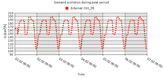
nplot('GDEM.CGS_05.Q.[ksm3/h];4;dot;R255G25B0;title=Demand evolution during peak period;legend=External CGS_05;[210;90;12];left','GDEM.CGS_05.CTRL;black;right;legend=Control Mode of the External')-
Plots, on the left y-axis, the satisfied demand, in ksm3/h, of the external CGS_05 as lines with: line width of 4, dotted style, and in "SteelBlue" color. A title and a legend are added to the chart. The y-axis is set between the maximum value of 210 ksm3/h and the minimum value of 90 ksm3/h, and divided into 12 equal intervals. The function also plots, on the right y-axis, the control mode of the external CGS_05 during the simulation. A black line with default line-with is used. The legend item for the object is customized.
1.7. Chart type
SAInt allows the user to choose the type of chart to be used in a plot from a pull of built-in options. Valid chart types are:
| Line type |
Time series can be represented using different types of lines with the keywords line, stepline, spline, and fastLine. The type "line" and "fastLine" are identical except for a more efficient way of the last in drawing complex paths. Similarly, "line" and "spline" produce similar results. |
| Stacks type |
Time series can be displayed using different type of area or column charts with the keywords area, stack, stack100, column, stackcolumn, and stackcolumn100. |
| Bar type |
Data can be displayed using two types of bar charts with the keywords bar or candlestick. The selected property is shown on the x-axis instead of the y-axis. |
| Scatter type |
Data can be displayed using scatter plots with the keyword scatter. |
Some limitations are in place:
-
Line style and line width specifications are not used with stack, bar, column, and scatter plot types.
-
Two data series cannot use the same color in any of the chart types.
-
The default chart type for conditional expressions is "stepline".
-
Only expressions with the same units of measure are valid in stacked plots.
-
The chart type "line" is the default type when using the plot commands
plot,nplot,meanplot, andintplot.
Furthermore, in chart types where two properties are necessary but only one is provided, SAInt uses the time steps.
Examples:
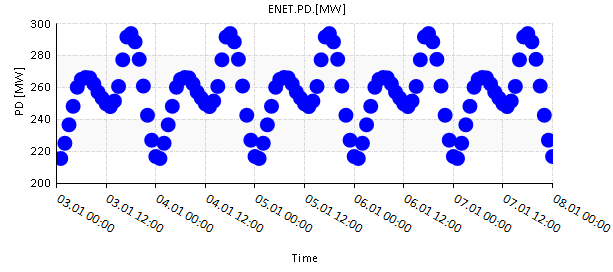
plot('ENET.PD.[MW];scatter;[300,200,5]')-
Plots the scattered plot of the active power served by the electric network against the time steps.
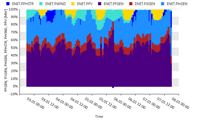
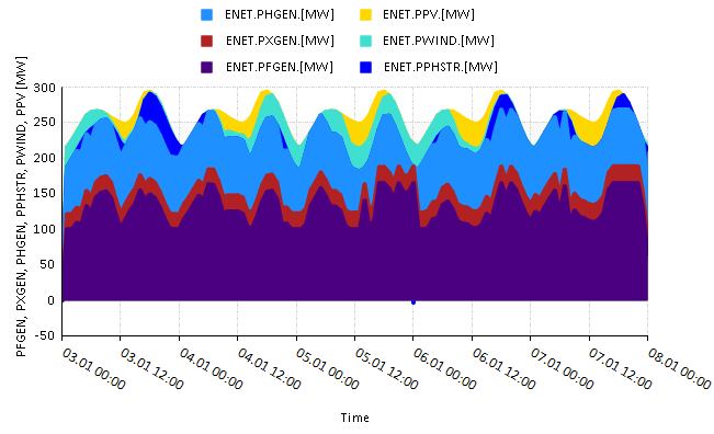
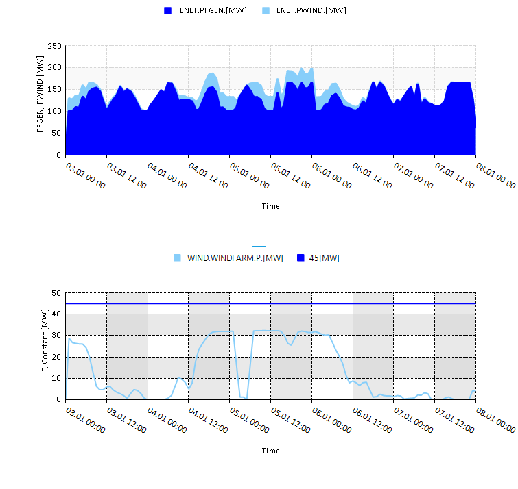
nplot('ENET.PFGEN;stackcolumn100;Indigo','ENET.PXGEN;stackcolumn100;Firebrick','ENET.PHGEN;stackcolumn100;Dodgerblue','ENET.PPHSTR;stackcolumn100;blue','ENET.PWIND;stackcolumn100;Turquoise','ENET.PPV;stackcolumn100;Gold')-
Plots the power generated by the fuel, generic, hydro, pumped hydro storage, wind, and pv generators as relative stack columns plot.
2. Plot functions description
The main functions creating charts in SAInt are described in the following sections with examples demonstrating how to use them.
2.1. The function plot
plot('expr','starttime','endtime')
Creates a plot within the given start and end time for the specified expression. If no start and end times are defined, it uses the default start time and end time given by the ChartStartTime and ChartEndTime properties in the scenario editor. An expr is the only mandatory argument.
Examples:
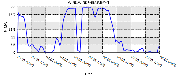
plot('WIND.WINDFARM.P.[MW]')-
Plots the power generated by the wind generator WINDFARM within the
ChartStartTimeandChartEndTime.
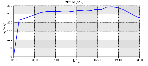
plot('ENET.PG.[MW];[300,0,6]','03/01/2022 00:00','03/01/2022 23:00')-
Plots the active power generated by the electric network within the specified start and end time.
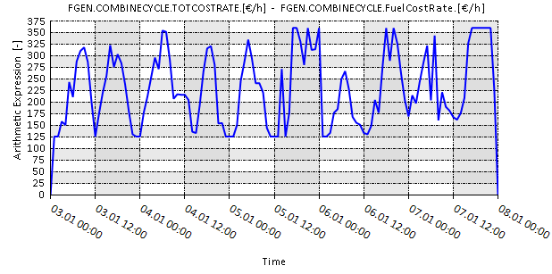
plot('FGEN.COMBINECYCLE.TOTCOSTRATE.[€/h] - FGEN.COMBINECYCLE.FuelCostRate.[€/h];[375,0,15]')-
Plots the difference between the total cost of operating the fuel generator COMBINECYCLE and its fuel cost.
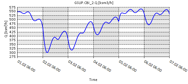
plot('GSUP.CBI_2.Q.[ksm3/h];[575,275,12]')-
Plots the flow from the gas supply CBI_2 within the
ChartStartTimeandChartEndTime. The expression also specifies the y-axis limits and intervals. Refer to Section 1.5 for defining limits and intervals.
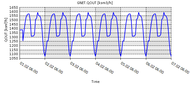
plot('GNET.QOUT.[ksm3/h];[1650,1050,12]')-
Plots the total outflow of the gas network within the default
ChartStartTimeandChartEndTime.
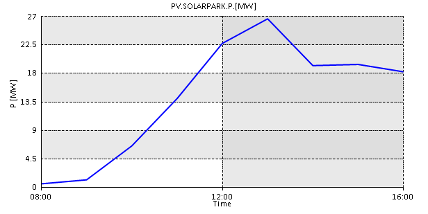
plot('PV.SOLARPARK.P.[MW]','+8','+16')-
Plots the power generated by the solar generator SOLARPARK from the 8th until the 16th hour of the simulation.
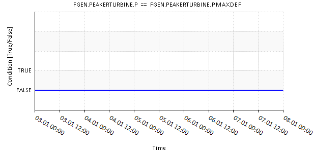
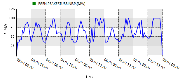
plot('FGEN.PEAKERTURBINE.P == FGEN.PEAKERTURBINE.PMAXDEF')-
Plots a Boolean (True/False) graph for the specified input expression.
2.2. The function stackplot
stackplot('expr(1)',…,'expr(n)','starttime','endtime')
Creates a single chart with stacked curves specified by the multiple input expressions. If no start and end times are defined, it uses the default start time and end time given by the ChartStartTime and ChartEndTime properties in the scenario editor. An expr is the only mandatory argument.
Example:
stackplot('ENET.PFGEN.[MW];indigo;[350,-50,8]','ENET.PXGEN.[MW];firebrick', 'ENET.PHGEN.[MW];dodgerblue','ENET.PPHSTR.[MW];blue','ENET.PWIND.[MW];turquoise','ENET.PPV.[MW];gold')-
Creates a stack plot of the power generated by all the fuel, generic, hydro, pumped hydro storage, wind, and pv generators. The y-axis boundaries set as 350 and -50 with 8 increments. Each generator type has specific color and the position of each stacked curve is defined by the their position in the input expression.
2.3. The function intplot
intplot('expr(1)',…,'expr(n)','integraltimestep','starttime','endtime')
Creates a separate plot with integral values for each of the input expressions. If no start time and end time are defined, it uses the default values specified by the ChartStartTime, and ChartEndTime properties in the scenario editor. The parameter integraltimestep and expr(1) are mandatory.
Examples:
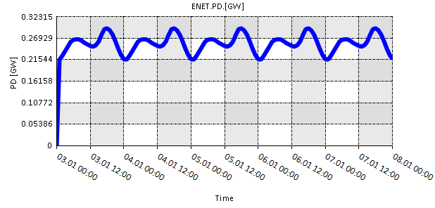
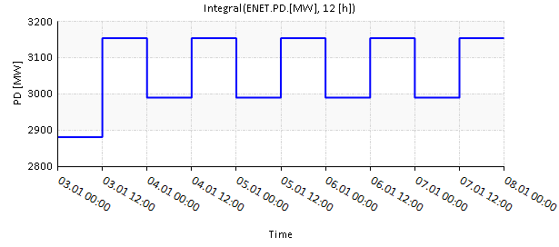
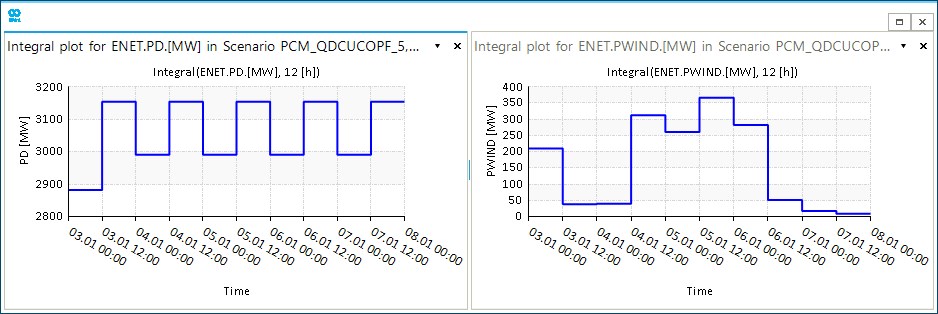
intplot('ENET.PD.[MW];[3200,2800,4]','12[h]','03/01/22 00:00','08/01/22 00:00')-
Plots the integral of the electric network demand using the integral time step, start time and end time specified in the input expression. The integral time step defines a horizon of 12 hours.
intplot('ENET.PD.[MW];[3200,2800,4]','ENET.PWIND.[MW];[400,0,8]','12[h]','03/01/22 00:00','08/01/22 00:00')-
Plots the integral of the electric network demand and wind power generation using the integral time step, start time, and end time specified in the input expression.
2.4. The function meanplot
meanplot('expr(1)',…,'expr(n)','meantimestep','starttime','endtime')
Creates a separate plot with mean values for each of the input expression. If no start time and end time are defined, it uses the default values specified by the ChartStartTime, and ChartEndTime properties in the scenario editor. The parameter meantimestep and expr(1) are mandatory.
Example:
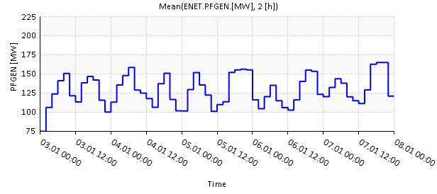
meanplot('ENET.PFGEN.[MW];[225,75,6]','2[h]','03/01/22 00:00','08/01/22 00:00')-
Plots the mean power generated by all the fuel generators using the mean time step, start time, and end time specified in the input expression.
2.5. The function nplot
nplot('expr(1)',…,'expr(n)','starttime','endtime')
Creates a single chart with multiple elements specified by the multiple input expressions. If no start and end time are defined, it uses the default start time and end time given by the ChartStartTime and ChartEndTime properties in the scenario editor. An expr is the only mandatory argument.
Examples:
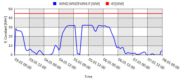
nplot('WIND.WINDFARM.P.[MW];[50,0,5];Blue','45[MW];Red')-
Plots the power generated by the wind generator WINDFARM and a constant line at 45 [MW].
nplot('FGEN.COMBINECYCLE.P.[MW];axis=left;Blue;[125,0,5]','FGEN.PEAKERTURBINE.P.[MW];Green;axis=left')-
Plots the power generated by the fuel generators COMBINECYCLE and PEAKERTURBINE on the same axis.
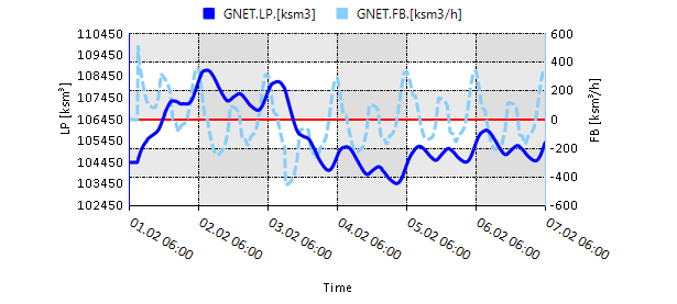
nplot('GNET.LP.[ksm3];axis=left;3;Blue;[110450,102450,8]','GNET.FB.[ksm3/h];axis=right;3;Lightskyblue;dash;[600,-600,6]')-
Plots the line pack and flow balance of the gas network based on a set of plot specifications.
2.6. The function subplot
subplot(nplot(),plot(),stackplot(),…)
Creates a chart window combining multiple plots from other plot functions.
|
Example:
subplot(stackplot('ENET.PFGEN.[MW];Blue;[250,0,5]','ENET.PWIND.[MW];Lightskyblue'),nplot('WIND.WINDFARM.P.[MW];[50,0,5];Lightskyblue','45[MW];Blue'))-
Plots the stackplot and nplot as subplots in a single chart window.
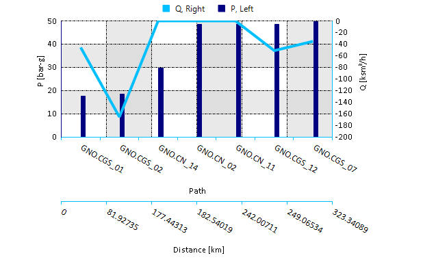
2.7. The function pathplot
pathplot('startnode','node(1)',…,'node(n)','endnode','property(1)',…,'property(n)','time')
Creates a chart with the change in property values along the path (nodes). By default, the shortest path from start to end node is drawn. Intermediate nodes can also be defined. The default time of the pathplot is the display time of the map window.
Example:
pathplot('GNO.CGS_01','GNO.CGS_02','GNO.CGS_07','Q;[ksm3/h];deepskyblue;Solid;4;[0,-200,10];Right','P;[bar-g];navy;column;10;[50;0;5];Left','03/02/22 06:00')-
Creates a pathplot from gas nodes CGS_01 to CGS_07 via CGS_02 showing the change in pressure and flow based on a set of plot specifications and the specified time.